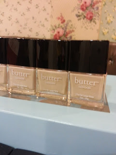
Just as I was beginning to think Spring would never arrive these beauties came into my life. Butter London have released their Sweetie Shop collection of gorgeous, sweet pasel colours. Something straight out of the 50's. Oh, and they fed us. Which is always good.
The colours are vidid but soft, bright without being neon - and are, as always, not tested on animals and "3 Free" - meaning they don't have nasty chemical ingredients with scary names. They also have the cutest names, ever!


Molly Coddled was one of the two varnishes I got to take home with me. It's a gorgeous soft lavandar - I refuse to use the word lilac, that's a bad word in my book. One coat will just about do it, but two coats are perfect. It has lasted really well on my nails. Lazy me hasn't taken it off yet so I'm currently typing with some very chipped talons ...
Jasper, the stunning yellow on the left, is such an eyecatching colour. If you see this on nails it's not as scary neon as you would think, it's a fantastic canary yellow - I never thought I would describe something as being like sunshine, but that's exactly what it's like!
Fiver, which is top of my wishlist, is an amazing soft mint. Less blue that Essie Mint Candy Apple, and possibly slightly nicer! ... I'll be shot for saying that, I know. It looks slightly turquoise in the press shots, but it's far more mint-icecream colour in real life. Simply beautiful.
Fruit Machine is the other colour nestled in my goodie bag. I haven't tried it yet, I'm not a pink person. But it may just tempted because it's not a shocking blue-pink like Barbie might be partial to, it's more like bright cherry blossoms.
Cuppa is an other one topping my wish list. It's a little hard to describe ... you know the end of a cappuccino when you mix up all the last of the foam with the coffee - I think that's what they're going for with this. A nice neutral, without being a nude-flesh colour. Terribly chic all together.
Okay, so I'm starting to realise that I want ALL of these polishes. Kerfuffle (good word) is the coral of the group. Again it's lovely and bright without being neon. A lot of corals last season seemed to be very harsh orange shades, but this is a far better balanced colour. This is definitely a colour to brighten up the otherwise dull Irish spring/summer.
Many people, I think, are a bit put out by the cost of these nail varnishes. I admit, once I got over €10, I do get a bit hesitant - but looking at this collection has got me thinking. In a range like this, there aren't going to be any duds - and let's be honest, there are a lot of duds out there. And while part of me does want all of these, I could easily see myself sticking to just one or two investment shades - and no, that's not delusional self-justification, hear me out.
Pick a trend colour, get a great quality polish and enjoy it for the season. Molly Coddled and myself will be seeing a lot of each other between now and August. I would happily spent €12+ on a nail varnish I will wear constantly over the next six months.
Would I buy the whole collection? Maybe.
If I didn't have rent to pay or weekly Bus/LUAS tickets to buy.
I think just a taste of it is enough to satisfy my sweet tooth for now.
... yeah, I'm not even sorry for that one.
I'll show myself out
xXx
Post by: Lisa Dunn


These polishes look lovely, especially cuppa and kerfuffle, what a fab name for a polish! x
ReplyDeletesrslylou.blogspot.co.uk/
Half of what makes them so great is the names I think! :P
DeleteOh my god, i love them all!!
ReplyDeleteCheck out a post I have in a few days, may satisfy your "cravings" ;)
Delete